We always enjoy bringing readers details of new Kickstarter projects and today we’re looking at the SLiM stand that makes an iPad look like a mini iMac. We think this is a very neat accessory that has real appeal and we think you’ll agree when you read about it. You may also want to view the video that we’ve embedded for you below this story.
Many of you will know that Kickstarter is a site dedicated to funding new product ideas, giving backers the chance to raise a target amount by the deadline in order to put a project into production. The SLiM Stand Like iMac is by Footmarker who set themselves a number of challenges for the stand. It had to have a simple design (inspired by the iMac), be simple to use and set up, and have an affordable price.
It looks as though they’ve achieved all of that and in fact they have designed two different SLiMs, the SLiM for iPad (or other tablets that have a flat surface) and the SLiM-mini (for the iPad mini). The stand is sanded-anodized aluminum based, has an iMac style design, a hole for the cable so that it goes neatly through the back, and foam pads that attach the tablet or anchor it on the desk. It’s said to be strong with no wobble or shake, and if it stands up to these claims we think it’s something that could attract a lot of buyers.
The short demo video below shows how easy it is to use the stand. At the time of writing a total of $5,162 has been raised from a target of $14,000 and there are still 20 days to go until the deadline. You may also be interested in two other Kickstarter projects for Apple devices, the iPhone 5 Craftwerk Aluminum case and the iPhone FUMM universal mount accessory.
We’d like to know what you think about the SLiM stand for iPad. Does this accessory appeal to you? Maybe you’ll be backing the project yourself? Let us have your comments on this.
Saturday, June 29, 2013
iPhone 5 vs. 4S, 4 on new iOS 7 beta update
Since Apple unveiled what is coming with the next update to its iOS operating system there have been a lot of users looking forward to the changes that it will bring to their mobile device. While we wait for iOS 7 to be released today we have the iPhone 5 vs. 4S, and iPhone 4 running the new beta update.
First up we have the iPhone 5 running iOS 7 with a build number of 11A4400f that brings some new features to the handset, and the latest beta release includes the return of the Voice Memos application. This is demonstrated and once you have recorded a message you can easily send it to your friends via email or message.
Siri now has new male and female voices that can be quickly changed by the user via the settings option of the app, and the app has been improved from the current offering. In the Control Centre at the bottom there is also a new icon for the clock, and the weather app has a new option for adding more cities.
With iMessage in a group chat you now get avatars and can also see the time and the lock screen has got slightly quicker from the previous beta of iOS 7. The FaceTime app has been tweaked with a transparent look that has also featured in the keyboard.
The iCloud settings now have the option at the bottom of finding your iPhone remotely and new wallpapers have been added on a different page along with multitasking now being quicker. The other videos run through the changes on both the iPhone 4 and iPhone 4S that include some of the same changes made in the iPhone 5 version.
Obviously some of these are hardware specific such as the Siri app but the Safari browser now features some quick short cuts when it is opened for the first time, and loads up pretty quick on the handset, especially compared to the iPhone 4.
The camera app panorama mode has been updated for both the iPhone 5 and 4S making it easier to use, but it has to be remembered that this software is still a beta so will have some minor glitches or bugs. Watch the videos in full and tell us what new features of iOS 7 you are most looking forward to.
Samsung Galaxy S4 Developer Edition price on Verizon
If you are in the US and have been waiting for the Samsung Galaxy S4 Developer Edition then we have some good news, as the Verizon variant is now available from Samsung. We have some details of this as well as the price of the Galaxy S4 Developer Edition on Verizon.
The Samsung website now lists the Verizon version of the Galaxy S4 Developer Edition. When this first appeared on the site, the AT&T version was also listed but that Developer Edition model has since been removed for the time being. The Verizon GS4 Developer smartphone still listed though and is virtually the same as a standard unlocked Galaxy S4. However, the Developer Edition does have an unlocked bootloader, enabling developers to easily use custom ROMs or hacks.
Specs of the Developer Edition (SCH-I545) include a 1.9GHz quad-core processor, 5-inch Super AMOLED full HD display with resolution of 1920 x 1080 and 441 ppi, 2GB of RAM and 16GB of internal storage, expandable via microSD. It has a 13-megapixel rear camera, 2-megapixel front-facing shooter, and runs Android 4.2.2 Jelly Bean skinned with Samsung’s TouchWiz UI.
Features include Air Gestures, Smart Scroll, Smart Pause, and Smart Unlock, along with much more. The Galaxy S4 Developer Edition on Verizon is priced at $649.99, and this model is only available in Black Mist. We should point out that this is not the same as the Galaxy S4 Google Edition that will release, as that phone will run stock Android Jelly Bean.
If you want to see more about the Samsung Galaxy S4 Developer Edition on Verizon, head to this Samsung product page. We have noticed though that currently this is on back order as it is out of stock. Will you be ordering the Developer Edition of this phone on Big Red? Let us know with your comments.
iPad 5 confidence in features after release failure
Earlier this month executives from Apple took to the stage for its annual WWDC keynote speech and while the company may have unveiled some new Macs and software, no new mobile devices were revealed. There were some though leading up to the event that showed confidence in the release of the iPad 5 and its features, but this obviously didn’t happen.
A few days before the WWDC event a case manufacturer seemed pretty confident that we were about to see the launch of the Apple iPad 5, and took the gamble of putting these products up on its website, which are still available even now.
The company seem pretty confident that its Gumdrop Cases will sync with the final design of the iPad 5 when it is eventually released by Apple, with the company even stating they are confident of the final dimensions of the device.
It has gone stuff wrong in the past regarding upcoming Apple products by designing a case more in line with the iPhone 5 only for the iPhone 4S to be released. The iPad cases fit in with rumours surrounding the release of the iPad 5 that will be thinner and smaller than the current full sized model, and borrow design ideas from the iPad mini with smaller bezels.
There has been talk that the displays for the iPad 5 will use the Sharp IGZO technology that can use a lot less power than current versions available, and it is thought the iPad 5 release date will come around the same time as the iPhone 5S and iPad mini 2, which will also mark the public release of iOS 7.
We often see other case manufacturers launching products for mobile devices before they have even been launched based on rumours, especially in China.
HTC Butterfly S vs Sony Xperia Z Ultra vs Galaxy Note 3
There are some very notable Android smartphones due for release over the next few months, and today we want to consider three of them. We’re looking at the HTC Butterfly S vs. Sony Xperia Z Ultra vs. Samsung Galaxy Note 3 and we’ll give you some key specs, although we’re particularly interested in considering the display sizes of these.
The HTC Butterfly S and Sony Xperia Z Ultra have now been formally introduced, so we have official specs on these two devices. However, the Samsung Galaxy Note 3 has not been unveiled yet, so for now we can only give you rumored specs of this device. The Butterfly S is due to release from the middle of July, first in some Asia Pacific countries, and then following to more regions. Meanwhile the Xperia Z Ultra is releasing at some point in Q3. No release date has yet been announced for the Galaxy Note 3, but it’s widely expected to be debuted at IFA in Berlin that takes place in September.
We’ll begin with the HTC Butterfly S, and this phone is powered by a 1.9GHz Qualcomm Snapdragon 600 quad-core processor with Adreno 320 graphics, has a 5-inch Super LCD3 display with resolution of 1920 x 1080 and 441 ppi, 2GB of RAM and 16GB of internal storage (expandable via microSD to 64GB). It also has a 4-megapixel UltraPixel rear camera, 2.1-megapixel front-facing camera, and 3200 mAh battery, and it runs Android 4.2.2 Jelly Bean overlaid with HTC Sense 5.
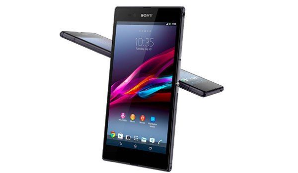
Moving on to the Sony Xperia Z Ultra, this phone has a 2.2GHz Qualcomm Snapdragon 800 quad-core processor, a 6.4-inch display with resolution of 1920 x 1080 and 344 ppi, 2GB of RAM and 16GB of internal storage (expandable via microSD up to 64GB). It also totes an 8-megapixel rear camera, 2-megapixel front-facing camera, 3050 mAh battery and it runs the Android 4.2 Jelly Bean operating system.
As we previously stated, the Samsung Galaxy Note 3 has not been officially announced yet but leaked and rumored specs so far include a Qualcomm Snapdragon 800 quad-core processor or Exynos 5 octa-processor, a 13-megapixel camera, and the likelihood that it will run on Android 4.2.2 Jelly Bean, although that could well be Android 4.3 when it finally arrives. For some time now, leaks and sources suggested the display size would increase again from the Galaxy Note 2 to 5.99 or 6-inches, although a more recent leak suggested it may be 5.7-inches.
We cannot give full specs and features of each device here, but hopefully we’ve given enough to give you some idea of what each phone has to offer. They will all be top-end devices and no doubt there will be pros and cons for each. Of course, personal preference of design and the price will also play an important factor in any choice between these three devices. What we really want to focus on at the moment though, is display size.
When the original Samsung Galaxy Note appeared it had a screen size of 5.3-inches, and at that time this triggered quite a debate about whether a phone with such a large display would ever catch on. Many felt that this was way too large and almost saw the Note as a gimmick, and it was soon dubbed a ‘phablet,’ suggesting a hybrid of a phone and tablet. However the huge success of the first Galaxy Note soon dispelled these concerns, and in fact a trend soon followed for smartphones with much larger displays.
Consider the display sizes the of the Butterfly S at 5-inches, the whopping 6.4-inch display of the Xperia Z Ultra and the Galaxy Note, expected to be between 5.7 and 6-inches, and you can see a wide variety of display sizes to suit everybody. Indeed the 5-inch screen of the Butterfly S now looks positively small when considering the Z Ultra. As these three smartphones will all have impressive specs, it could well be the display size that plays a major part in choosing one of them over the other two. If you want to check out some videos of the Butterfly S then you may be interested in our previous article here, or for the Xperia Z Ultra here. We’ve also embedded two more videos for you below this story, one on the Butterfly S and the other on the Xperia Z Ultra.
It seems that ultimately the consumer wins, as these three phones represent a wide variety of display sizes, but we’d really like to know what you think about this. Does the display size of a smartphone now influence your decision about which to purchase? Are you a fan of larger or smaller displays? If you could pick the HTC Butterfly S, the Sony Xperia Z Ultra or the Samsung Galaxy Note 3 and adjust the display size to suit you, what size would you choose? Send your comments to let us know.
BlackBerry Q10 vs. Z10 and iPhone 5
A few months ago BlackBerry launched its new operating system and compatible hardware to the world as it looks to regain some of its lost market share. Today, we take a look at how the BlackBerry Q10 stacks up against the BlackBerry Z10 and Apple iPhone 5. Our first three videos will look at the BlackBerry Q10 vs. Z10, and then these are followed with some comparisons looking at the BlackBerry Q10 vs. iPhone 5.
BlackBerry got things started with the launch of the touchscreen Z10 but more recently returned to its roots with the QWERTY sporting BlackBerry Q10. But how do they compare? There is a good chance that BlackBerry fans would have picked either one of the handsets based on their love for a touchscreen or a physical keyboard.
The first three videos that we have embedded for you below are comparing the two BB10 handsets, and it quickly becomes apparent how much squarer the Q10 display is while obviously being smaller. This also means that there are less apps displayed on the screen at the same time so more sideways scrolling is needed.
The slide up action that lets you return to the home page or look at messages is a lot easier on the BlackBerry Z10 as the keyboard can sometimes get in the way on the other device. The bundled keyboard on the Z10 is pretty good and better than some stock Android offerings, but still lags behind the likes of SwiftKey.
While the physical keyboard on the Q10 still comes with dictionary predictions and other features you would expect on a virtual keyboard, but can be very hit or miss at times. One clever feature of the Q10 is that when you are holding the device normally and taking a video the handset is shooting it in landscape mode, and all three of the first videos find positives and negatives for both handsets when compared against each other.
We then move on to the comparisons of the BlackBerry Q10 and the iPhone 5 that may not seem fair as many that have set their heart on one of the devices may not consider the other handset. The multitasking on the new BB10 is arguably the best that has been made available so far and also features a voice control system.
This was found not to be nowhere near as good as Siri on the iPhone 5 and spec wise the rear facing cameras on the handsets match up, but in use while both devices offer good quality images the iPhone 5 produces a more vibrant and vivid image which is probably down to the lens.
The BlackBerry Q10 was found to be a worthy handset in our recent hands on review with the operating system to be the biggest positive, and once larger BB10 displays become available more consumers will hopefully give the platform some consideration.
Watch the videos and tell us what you think about the three handsets.
Sony Xperia SP M35t, C S39h specs and Chinese release
We have some details today of two upcoming Sony smartphones, the Sony Xperia SP M35t and C S39h. We’ll give some specs for each device and news on their China release. The M35t is specifically for China but there’s no news yet on whether the C S39h will release in other regions.
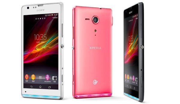
First we’ll tell you a little about the Sony Xperia SP M35t. This is for the market in China, and is enabled with TD-LTE as a variant of the Xperia SP. The M35t with TD-LTE is compatible with the 4G network of China Mobile. It has a 1.7GHz Snapdragon S4 Pro dual-core Krait processor, a 4.6-inch 720p display, and the bottom of the device features a transparent LED strip, which can be customized. This one runs the Android 4.1 Jelly Bean OS and will be available in black, white or pink color options.
The Xperia C S39h is a dual-SIM smartphone and is powered by a 1.2GHz MediaTek quad-core processor, and has a 5-inch qHD display with resolution of 960 x 540. It also has an 8-megapixel rear camera with Exmor R sensor and runs the Android 4.1 Jelly Bean operating system. The C S39h will be exclusive to China Unicom and comes in white, purple or black color options.
There are no specific release dates for China just yet, and no news on pricing either. You can be sure we’ll pass that on to you as we hear more. We’d like to hear your thoughts on these smartphones so let us have your comments.
Source: Engadget (1) (2)
Casio G’zOne Commando specs, price and release date
There will be many of us that need a smartphone that is better suited to certain more extreme conditions that many of the thinner smartphones that are now available wouldn’t cope with. We now have news of the Casio G’zOne Commando specs, price and release date.
If you are on the lookout for a rugged smartphone and are a customer of Verizon Wireless the Casio G’zOne Commando 4G LTE may be ideal. This Android powered smartphone will only set you back $99 after a $50 mail-in rebate, and for your money you get a handset that is tough enough to cope with shock, water, dust, humidity, and vibration.
The device will be available via the carriers online and brick and mortar stores from tomorrow and features a 4-inch WVGA touchscreen display that can even be used with gloves, and is powered by a dual core processor clocked at 1.5GHz with 1GB of RAM running the Android Ice Cream Sandwich operating system.
There is also an 8-megapixel camera on the back capable of Full HD video capture, 1.3-megapxiel front facer, FM radio, and 16GB of internal storage. The handset even comes pre-loaded with some useful apps that include G’zWorld that records your movements on a map and tracks your running or hiking routes.
The Live G feature lets you connect with other G’zOne users around the world, and other features include sun and moon displays, tide views, temperature comparisons, an earth compass, and much more.
Source: Verizon.
New iPad mini and Nexus 7 2 to meet Acer Iconia W3
The tablet PC market space has got a lot more crowded in recent times and was arguably kicked off with the launch of the original iPad only three years ago. In the coming months though we are set to see even more devices being released, and the new iPad mini and Nexus 7 2 are to meet the Acer Iconia W3.
The recently announced Windows 8 Acer Iconia W3 tablet is likely to have a fight on its hands in the coming months trying to attract consumers. The device that features an 8.1-inch LCD display at a resolution of 1280 x 800 that is powered by a dual core Intel Atom processor clocked at 1.8GHz, while storage comes in either 32GB or 64GB flavours that is expandable via microSD card.
It is priced at $349.99 for the cheapest version of the W3 and could bring it above what the next versions of the iPad mini and Nexus 7, although the Nexus 7 will be slightly smaller. There have long been rumours that the Nexus 7 refresh will feature a Full HD display surrounded by smaller bezels, making the device easier to hold in the hand.
Other specifications are expected to include a quad core Qualcomm Snapdragon S4 Pro processor along with 2GB of RAM with a 5-megapixel rear facing camera, and a 1.3-megapixel unit around the front. Unfortunately the device will probably come with non-expandable storage which will be the same as the devices main rival the iPad mini 2.
The next smaller tablet PC from apple will be going up against the 2nd generation Nexus 7 this year, and there have been mixed reports whether the device would feature a Retina Display. Most recent claims have suggested the device will have a display with a resolution of 1024 x768 along with a slimmer design powered by an Apple A6 processor.
This will also come running the new iOS 7 operating system but the iPad mini 2 will likely be the most expensive of the three devices but until it is announced officially we won’t know for sure.
Are you planning on getting a new tablet in 2013?
LG Optimus G2 photos: size, specs and expectations
The upcoming LG Optimus G2 is widely expected to be unveiled at an LG event being held on August 7, and this Android smartphone is generating a lot of interest, as it’s a successor to the Optimus G. We’ve already seen unofficial specs for this device, and now some leaked LG Optimus G2 photos have emerged, prompting us to think about the size, specs and expectations for this handset.
Last month we showed a leaked image of what was claimed to be a prototype of the LG Optimus G2, and slowly we have been hearing about various specs for the phone. The Optimus G2 looks set to have a quad-core Qualcomm Snapdragon 800 processor, with Adreno 330 graphics, while other inclusions could be a display of around 5.5-inches with full HD, 2GB of RAM, a 13-megapixel rear camera, and running Android 4.2.2 Jelly Bean. However, much of this is not yet confirmed, so for now we need to be aware that this is unofficial.
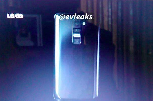
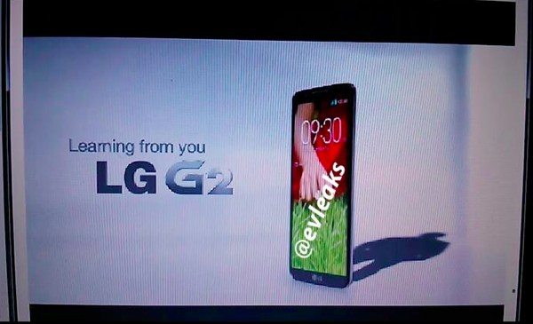
A set of leaked slides purporting to be of the LG Optimus G2 has now come to light, and we are showing you some of the images here. Of course we cannot verify whether these are the real deal or not, but they do come from Evleaks on Twitter, and this source is coming up with a lot of reliable information lately. If you check out the photos you can see new -/+ buttons on the rear of the phone near to the camera, which is rather interesting.
Also one of the images appears to be a promotional ad that simply refers to the phone as the LG G2, dropping the Optimus from the title. It’s always difficult to tell an exact display size from images so this is still to be clarified, but if the 5.5-inch screen being rumored is accurate, that’s quite a step up from the 4.7-inch display of the Optimus G. We can also see from the leaked images that the phone is extremely slim and looks to have very thin bezels.
We’d like to hear what you are hoping for with the LG Optimus G2. If the rumors of a 5.5-inch display are correct, would you be pleased with that increase in size from the Optimus G? What other specs would you like to see confirmed? Tell us your expectations for the Optimus G2 by sending us your comments, as we’re always interested in what readers have to say.
iOS 6 vs iOS 7 icons in popularity choice
iOS 7 is at beta 2 stage for developers, and even though it has not released to the public yet we would like to ask what developers think about the new icons and the way they look. Of course some of the public can answer this as well, as they might have installed iOS 7 unofficially, or could have had a good look at some of the many reports on the upcoming operating system. For iOS 6 vs. iOS 7 icons in a popularity choice, which do you prefer?
Before the official introduction of iOS 7 at Apple’s WWDC recently, there had been a lot of speculation about the new-look OS. It was widely rumored that the new iOS under the influence of Apple guru Jony Ive, would be moving away from a skeuomorphic look to a far cleaner and and flatter design. When iOS 7 was finally unveiled it soon became clear that the leaks had been correct, and a more industrial and uncluttered look was evident.
We’ve written many posts now about iOS 7, and opinion seems to be divided between those who are keen on the revamped interface and those who wish that Apple had left things well alone. We’re really interested to find out whether developers favor the more streamlined appearance of iOS 7 icons or the fussier guise of iOS 6 icons. To be fair there may also be many developers or consumers who don’t have a strong opinion either way and may not have even noticed a difference.
Of course we should remember that many people don’t like change initially, and as Apple’s iOS design has barely differed over the last six years, for some people this could be considered a major change. However, there is often an uproar when new interfaces are introduced (such as on Twitter or Facebook), but this usually dies down pretty quickly once people get used to something.
The image below shows some of iOS 6 icons followed by their iOS 7 equivalents, and we feel that the iOS 7 icons are more clearly defined. They lack any texturing or shading, giving that ‘flatter’ appearance, and although some may miss the older icons, we think the new-look icons are perfectly acceptable and quite admire the new design. Obviously everybody has different thoughts though and this is something that seems to be polarizing opinion, so we’d like to know what you think.
When comparing the rejuvenated iOS 7 icons with their older counterparts, which do you like the best? Do you wish Apple had stuck with the more detailed look of the older icons, or maybe you much prefer the fresh feel of the new icons? If you’re a developer with a view on this, or a consumer, we’d like to hear your comments to get an idea of how the new look has been received.
Birthday Reminder app for iOS the easy way to remember
It can be quite easy to forget some people’s birthdays only remembering at the last minute before rushing out to the shops or purchasing some sort of digital gift or card, but today we have news of the free Birthday Reminder app for iOS that is the easy way to remember those dates.
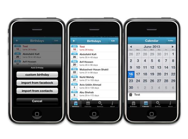
This new free application will provide iOS users and easy way to remember people’s birthdays via their mobile device without the need of entering them all manually into the hardware. Birthday Reminder will automatically import birthday data from a users Facebook account or their address book.
Birthdays can still be added manually and the app will send a birthday notification to the user several days before the date of the birthday that will give enough time to send a card or gift via mail. Upcoming birthdays are listed soonest first so you will know who to shop for.
Users can change the settings in the app so it notifies them well in advance of anyone’s birthday, and they can even set the time of day a notification will be sent to them via their mobile device. There is even the option of switching off the notifications and use the application manually.
Birthday Reminder 1.0 is available free and worldwide on the App Store for owners of the iPhone, iPod Touch, and iPad running iOS 5.1 or later.
Umeox X5 vs Huawei Ascend P6 for slim smartphone title
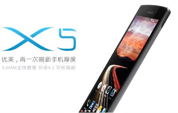
While we have seen smartphones getting larger displays powered by more powerful processors in the last couple of years they have also become a lot thinner and lighter, and today we are looking at the Umeox X5 vs Huawei Ascend P6 for the slim smartphone title.
While Chinese manufacturer Huawei recently launched the Ascend P6 and labelled the device as the slimmest smartphone at only 6.18mm thick, but now there is a new handset that has been announced that comes in even thinner and it is another Chinese handset called the Umeox X5.
The X5 has a 5.3-inch display of unknown pixel resolution that compares to the Ascend P6 that has a 4.7-inch HD resolution display. The P6 has a quad core 1.5GHz processor with 2GB of RAM under the hood that compares to the X5 that has a dual core unit of unknown clock speed or RAM. Both handsets will be running the Android 4.2.2 Jelly Bean operating system though.
On the X5 there is an 8-megapixel rear facing shooter along with a 3-megapixel front facer, which compares to the Ascend P6 that uses the same sized sensor on the back with a 5-megapixel camera on the front.
The X5 though only measures 5.6mm thick compared to the 6.18mm of the Ascend P6, and yesterday Sony announced the Xperia Z Ultra that is also pretty thin at 6.5mm. It is believed that the Umeox X5 will be arriving in Europe during the summer with France getting first dibs on the handset.
Do you think that smartphones are getting too thin?
Source: GSM Insider.
iPhone 5S mass production and release hint with photo
History will tell us that we are getting closer to the launch of a new iPhone model as we begin to see numerous parts leak and sometimes a working model left in a bar. Speculation has been mounting recently about what we can expect to see this year and it seems that there is a hint of the iPhone 5S hitting mass production ahead of a release from a photo.
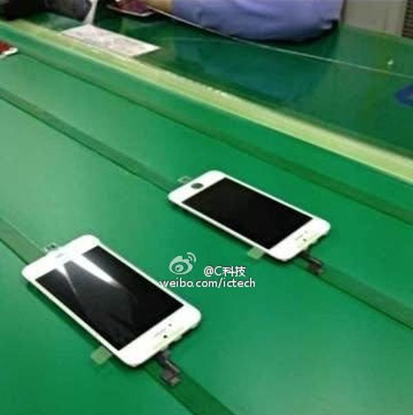
The image that you can see on this page is allegedly showing the iPhone 5S display assemblies that seem to be on a production line. Images of the component recently surfaced and while the picture isn’t perfect you can still make out the redesigned flex cable connectors.
On the current model of the iPhone 5 the two connectors are both fixed horizontally but on this component one of them is placed vertically. This hints that mass production of the iPhone 5S display assemblies has already begun and may mean the handset could be launched earlier than expected.
Last month there were rumours that Sharp had begun production of displays for the handset with this set to hit full speed this month, and if the device is coming to the public in September Apple may be looking to release the iPhone 5S in more markets straight away.
There has been talk that the next version of the iPhone could feature a finger print scanner placed into the bezel, and this news also follows more images of an early prototype of the handset that included a bigger battery and dual flash camera.
It is also believed that the iPhone 5S will launch alongside the iPad mini 2 and bring with it the new iOS 7 operating system.
Do you think this image shows that production is underway for the iPhone 5S?
Source: Weibo via G4Games.
Sony Xperia ion getting a taste of some Jelly Beans
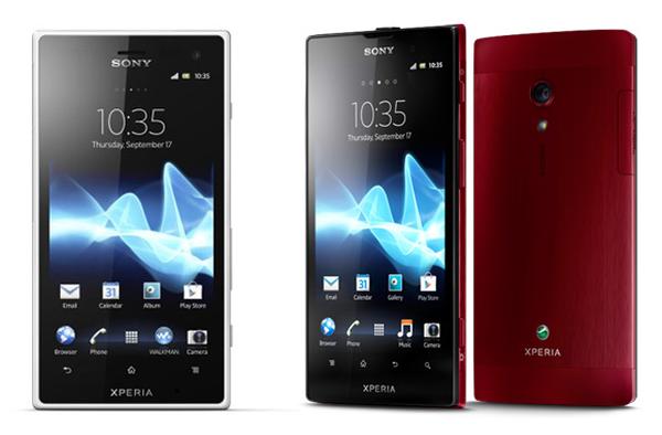
It is always nice when an older smartphone gets refreshed with a new version of the operating system that it is running on, and Sony has been rather busy of late getting older hardware updated to the Android Jelly Bean OS, and now it’s the turn of the Sony Xperia ion to get a taste of some Jelly Beans.
The company may have been showcasing some new hardware yesterday but it began updating the likes of the Sony Xperia Z, and now it’s the turn of the Xperia ion to receive the much welcomed update after it recently received certification.
While the aging smartphone may only be getting the Android 4.1.2 version of the Jelly Bean update, it will bring a whole new lease of life to the handset as it is a bigger step up from ICS when compared to Gingerbread.
The update will need to be carried out via the Sony PC companion and not as an over the air update, but that is a small price to pay to receive a whole host of new features on the smartphone.
Some of the new features of the update include Google Now and expandable notifications, and of course the faster and smother experience thanks to Project Butter. The build number for the update is version 6.2.B.0.211, and let us know in the comments section if you have received it yet and how it went.
Source: Xperia Blog.
Tuesday, June 25, 2013
Apple vs Samsung in syncing patent infringement
There seems like the various court battles going on around the world between Apple and Samsung will never come to an end, as the bitter rivals continue to argue over various patent disputes. Now there has been another ruling in the Apple vs Samsung fights in a syncing infringement.
Apple has lost the latest round of disputes in a lawsuit which claimed that Samsung had broken a patent that covered the synchronizing of music and video data on Galaxy devices with the company’s servers. The decision by Intellectual Property High Court in Tokyo, Japan upheld a previous ruling in Samsung’s favour.
Samsung obviously welcomed the decision but Apple didn’t immediately comment on the matter, but the ruling continues the battles taking place across four different continents. Apple has accused Samsung of copying a number of its devices, while others believe the accusations come from worries about the competition Samsung now poses in the Smartphone world.
This news comes after Apple won a separate case in the country after a court ruled that Samsung broke what is called the bounce-back patent, and reports recently have suggested that Apple would be moving away from using Samsung for the supply of key components for the iPhone from next year.
Around the world it is believed that Samsung now accounts for 33 percent of the smartphone market, which compares to Apple that enjoys around 18 percent of the global market.
Do you think either company has a case to answer?
Source: Bloomberg.
WordsPlus and VitalSigns for BlackBerry 10 visualised
The BlackBerry 10 operating system launched with an impressive amount of applications available to users from the beginning, and since then this number has increased further. We now have both the WordsPlus and VitalSigns applications visualised for BlackBerry 10.
BlackBerry 10 may be behind the likes of Android and iOS with the amount of apps available but that’s not to say there are not a growing number of quality apps being released. Below this article we have embedded a couple of videos that are demonstrating a couple of clever apps for the BB10 operating system.
First up is the VitalSigns application that allows users of BB10 to keep a track of that all important battery status along with the amount of memory space you have left on your handset. It can be customized by the user that includes the backgrounds and battery icon, and is available via BlackBerry World priced at £0.75/$0.99.
Next is a video demonstrating WordsPlus which is a fun packed word search game that sees you trying to find the words hidden in a rectangular grid of letters. To select the word all you need to do is simply glide your finger across the screen and the game has three levels of difficulty along with three main categories.
Each of these has five or six topics to choose from with the game getting many positive reviews and can be downloaded from BlackBerry World for £0.75/$0.99, or there is a limited free version available here.
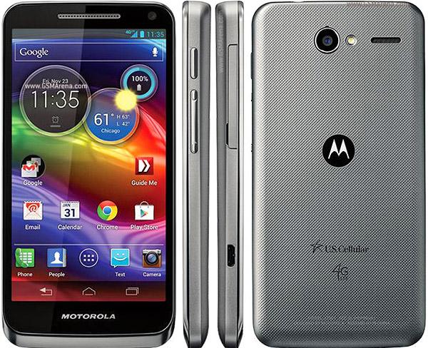
Motorola Electrify M for U.S. Cellular in quick hands-on
If you are in the market for a mid range smartphone running on the Android platform there is a great choice of handsets to choose from that also come in at a good price level, and today we have a quick hands on video of the Motorola Electrify M for US Cellular.
The handset may have been around for a while but even now it still has a lot to offer for a relatively low asking price, as if you agree to a new two year contract the Motorola Electrify M can be yours for only $99.99.
This gets you a smartphone that is basically the US Cellular version of the Verizon Wireless Droid Razr M and offers a smartphone with a 4.3-inch Super AMOLED Advanced touchscreen display with a resolution of 960 x 540.
Under the hood is a dual core processor running at a 1.5GHz clock speed 1GB of RAM running the Android 4.1.2 Jelly Bean operating system, and there is 8GB of internal storage expandable by a further 32GB via a microSD card.
Below you can see a quick hands on video that has been recently posted to YouTube, and reveals a nice and compact smartphone with an almost edge to edge display. It has the carrier’s neat circular widgets that allow quick access to a number of features, and if you are thinking of purchasing the device check out the rest of the video or you can purchase one here.
Sony SmartWatch 2 (SW2) perfect with Xperia Z, ZR and Ultra
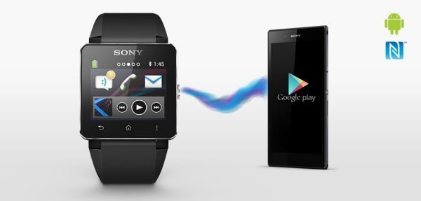
Earlier on today the Xperia Z Ultra was officially announced and now to add to the unveiling line-up is the new Sony SmartWatch 2 (SW2), this is the third-generation watch that will work very well with the likes of the Sony Xperia Z, Xperia ZR and the Z Ultra and other Android smart devices.
The SmartWatch 2 looks rather good and we would be proud enough to walk down the street donning one on our wrist; it will work with most Android smartphones but would look better with an Xperia device, matching brand and all that.
If you looked at the design you would think this was a normal watch, we have seen standard watches breaking the large size barrier.
The SmartWatch 2 comes with a 1.6-inch Transflective LCD made with Aluminum and plastics with 220×176 pixels, it will work as an NFC watch with many smartphones using Android 4.0 Ice Cream Sandwich and above, it also comes featuring Bluetooth 3.0, micro USB charging and multiple languages.
The smart watch also comes with pre-installed apps and plugins such as Facebook, SMS, Twitter, App recommender, Calendar notification, MMS, Google+, New events aggregator, Missed call notification, Missed call, Gmail, Email, and so much more – read the full list here.
The Sony SmartWatch 2 is splash proof but not good enough to use in the shower, bath or whilst swimming etc. You can connect the watch to your Android smartphone or tablet via Bluetooth, and instead of looking at incoming calls or text messages via your phone you can do it all from the watch itself.
Love the fact you can use the watch as your music remote control and check social networks as well, it has a stainless steel wristband and aluminum body and apparently looks great even in very bright sunny days.
The release date and price has not yet been announced but will start shipping worldwide from September 2013.
Would you buy the Sony SmartWatch 2?
Samsung Galaxy S4 faster than HTC One, iPhone 5 in UK
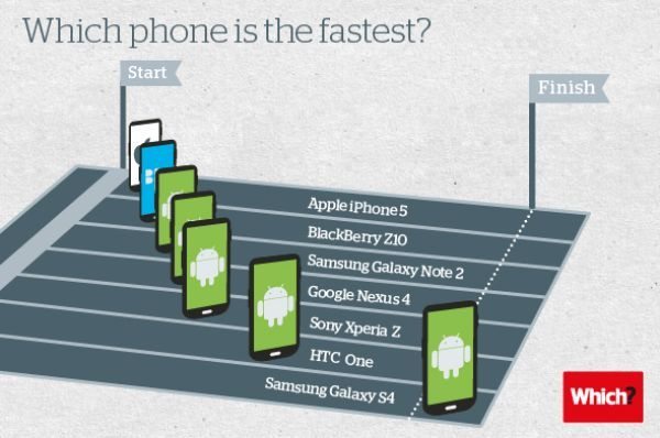
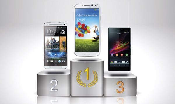
Grab seven smartphones and test their speed capabilities in the UK and results come in that puts the Samsung Galaxy S4 ahead of the iPhone 5 and HTC One, now we will explain how.
Many high-end smartphones have been released with top processors to provide faster speeds, but in some case larger processors does not mean super performance according to Which? They decided to get their hands on seven smartphones to test to see what one would be fastest.
This year the Apple iPhone 5 was the best selling smartphone on the market back in February, but the Samsung Galaxy S4 came out on top for being faster.
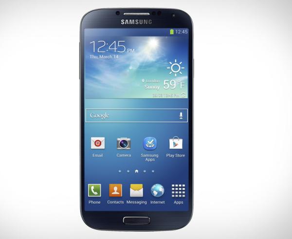
The Galaxy S4 comes with a 1.9GHz quad-core processor and the iPhone 5 has a 1.2GHz dual-core processor, the Geekbench 2 test was performed on each device that covers both memory and performance. The Samsung Galaxy S4 score came in at number 1 with 3188 and the iPhone 5 16GB was at number 7 with only 1664.
In at number 2 on the list was the HTC One with a score of 2798, Sony Xperia Z 2173, the Nexus 4 scored 2134, Samsung Galaxy Note 2 1950, and in at number 6 beating the iPhone 5 also was the BlackBerry Z10 scoring 1698.
The higher the Geekbench 2 score the better the phone will perform when playing intensive games, multi-tasking on many apps and photo-editing etc.
Do you buy smartphones based on speeds and benchmark tests?
Samsung Galaxy Note 3 display size deliberation
The Samsung Galaxy Note 3 will release this year at some point and the main factor other than the specs within is the display size deliberation, should it be the same size as the Galaxy Note 2 or bigger?
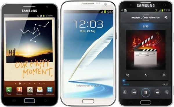
The above question has popped up on many occasions and it is a thought that is worth more consideration, the Note 2 was released with a 5.5-inch display and now there are rumors thanks to @evleaks that the Galaxy Note 3 could have a possible 5.7-inch display.
The original Note released with a 5.3-inch display, then it went to a 5.5-incher on the Note 2, so does it make sense to knock it up to 5.7? It does seem to follow suit each time a new Note is released.
We have heard rumors of the Note 3 releasing with a 5.9-inch display, but the 5.7 makes more sense judging on the last Note series smartphones. Samsung could then concentrate on better ppi and the bezels etc; it is not too shabby having a 5.7-incher.
It has come up in conversation that releasing the Galaxy Note 3 with a 5.9-inch or bigger display it will be more like the Samsung Galaxy Mega 6.3, and some have said in the interest of consumers releasing two devices with similar screen sizes would confuse matters, we will let you answer this one in the comments.
We asked friends, work colleagues and social followers what would be the ideal Samsung galaxy Note 3 display size, and we got mixed feelings in return. Some replied by saying moving the display size from the Note 2’s 5.5-inch to only a 5.7-inch on the Note 3 would not be much of an upgrade, a few others said 5.7-inches is a perfect size otherwise you will be pulling a tablet out of your pocket and not a smartphone.
Phones Review Says
It is matter of personal preference, we would personally like between 5.5 to 5.7-inches, as that would be perfect for what we would use it for. Everyone has an opinion and what is right for them, even if Samsung release a 5.7-inch Note 3 that is not too bad at all and they could concentrate on more innovative ideas to push the specs barrier up to a whole new level.
What do you think is the perfect Samsung Galaxy Note 3 display size?
Best photo apps for Android editors
There are a number of different photo editing applications that are available for users of the various mobile platforms and the great thing is that a lot of them are available free, and today we looking at some of the best photo apps for Android editors.
Photo Editor is promised to be a simple and easy to use application for photo manipulation with users being able to adjust the colour, rotate, crop, resize, add effects, frame, and even draw onto photos. There is an easy pinch and zoom interface to help users to get the look that they are after, and creations can be saved to your SD card, gallery, set as a wallpaper, or shared via the likes of Facebook and Twitter.
In a recent update support has been added for more languages along with some bug fixes plus some other improvements, and Photo Editor can be found on Google Play. Next up we have the BeFunky Photo Editor application that promises lots of effects that can’t be found elsewhere.
The app even allows users to add text to their images and there is the option of undoing any changes made to images, and each picture can be made public or private. There are 29 free effects included in the download along with some powerful editing tools at your disposal, and new Summer Effects, new fonts and some bug fixes have recently been added to the app that can be downloaded here.
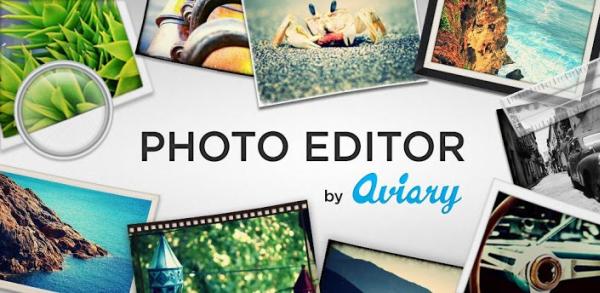
Another offering we have for you is Photo Editor by Aviary that has been designed to create a quick and easy way for users to edit their photos while on the go. The app includes features such as one tap auto enhance, fun stickers, colour balance, redeye fix, whiten teeth, sharpen and blur, and much more.
The app has recently been completely redesigned with a new user interface that is faster and easier to use along with some new effects and bug fixes. Photo Editor by Aviary can be found on Google Play as a free download.
Snapseed is another free application that is available for Android users running Ice Cream Sandwich and above, which allows you to transform your photos with a number of advanced features. These include adjusting them with the single tap auto correct, adding fun and innovative filters, and the built in Google+ feature makes it even easier to share your creations.
Recent new additions to the app include a Retrolux filter, updated frames filter, and some other bug fixes and enhancements while the app can be found on Google Play for free.
Finally we have the hugely popular Instagram app that is being used by over 130 million users and offers a quick and simple way to share your favourite moments. Users can customize their photos using some custom built filter effects and then easily share creations to friends and family.
All of the filters are completely free with instant sharing to Facebook, Twitter, Foursquare, Flickr, and Tumblr with unlimited uploads available. The app has recently been treated to a new video feature for devices running Android 4.1 or above and can be downloaded here.
Do you use any of these apps?
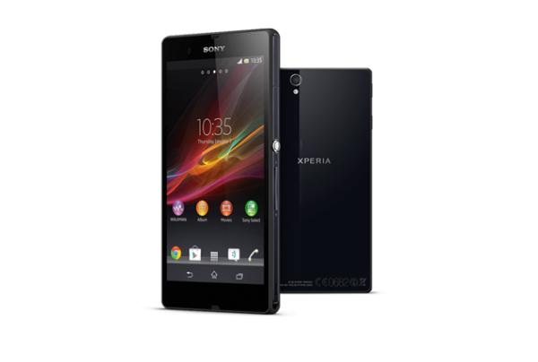
Sony Xperia Z Ultra offical heavy specs and video visuals
Today Sony unveiled its new Sony Xperia Z Ultra 6.4-inch marvel, and this smartphone come tablet is set to turn heads with its heavy specs. This device was once known as the Togari and comes with stunning features thanks to its official announcement.
No more wondering to do now because the Sony Xperia Z Ultra is real, before we get into the specs and features we just want you to know there are two stunning videos of this device in action.
The Sony Xperia Z Ultra specs are impressive and include a 6.4-inch Triluminous 1080p resolution display with 344ppi pixel density, as well as featuring Sony’s OptiContrast and X-Reality technology, which is a step up from the usual Mobile BRAVIA tech.
Other than the screen being huge, it also comes with the super Snapdragon 800 processor, and we know that this ARM chip is the speediest ever to be put into a smartphone.
The Samsung Galaxy Note 2 came with a stylus, which is lovely to use, but users can use a pencil, pen or a capacitive stylus on the Sony Xperia Z Ultra and that is a nice touch. The graphics comes via the Adreno 330 GPU and the quad-core Krait 400 processor has been clocked at 2.2GHz, we cannot wait for the official benchmarks when they release and when they do we will be on top of this.
Android 4.2.2 Jelly Bean will be on board when you purchase as well as an 8MP Exmor-RS sensor rear camera capable of recording in 1080p video, it also supports HDR as well. It also has a 2MP 1080p@30fps front-facing camera.
The waterproof Full HD smartphone has 16GB of built-in storage, but remember 11GB of this is user-accessible, it also comes with a microSD slot for 64GB extra space. The design looks stunning and has a 6.5mm slim look, you will be happy to know it has an IP58 certification not IP57, which means it is water-resistant.
Key Features Include: 6.4” Full HD TRILUMINOS Display with by X-Reality, waterproof and dust resistant, 2.2 GHz quad-core Qualcomm Snapdragon 800 processor, 4G LTE, use anything like a pen or pencil as a stylus, HD Voice, WALKMAN player with ClearAudio+ and xLOUD enhancements, NFC and it weighs only 212 grams, and comes with a 3000 mAh battery with Battery STAMINA Mode for better battery life.
http://blogs.sonymobile.com/press_release/the-new-xperia-z-ultra-the-worlds-slimmest-and-largest-full-hd-smartphone-display/
Install JAY Z Magna Carta app for free album
We all like to get something for free and if you are the owner of a select number of Samsung Galaxy smartphones there is a nice freebie on offer, and all you need to do is to install the Jay Z Magna app to stand a chance of receiving a free album.
The application will give the chance to one million lucky Samsung Galaxy owners the chance to receive the new Jay Z album, and not only will you get it for free it will be available a few days before it sees a global release to the public.
The offer is open to owners of the Samsung Galaxy S4, Galaxy S3, and Galaxy Note 2 and is a clever marketing strategy that will work for both Samsung and Jay Z. The offer is only open to select markets though which are Australia, Austria, Canada, France, Germany, Hong Kong, Japan, Netherlands, Singapore, South Africa, South Korea, and the United Kingdom.
This news was first reported over a week ago and has since led to some lengthy debates on whether the album deserved to gain platinum status before it is even officially released. If you fancy the chance of getting a free digital copy of the Jay Z Magna Carta Holy Grail on July 4th head over to Google Play to download the app.
Samsung Galaxy S4 LTE Advanced release speculation
A few months ago Samsung introduced the world to its new Galaxy S4 smartphone that become the latest flagship device available to excited consumers, fast forward to the present day and we have seen a number of other models unveiled, and now there is growing speculation that we are about to see the release of the Samsung Galaxy S4 LTE Advanced.
We last heard talk of a supercharged Galaxy S4 LTE Advanced just over a week ago and followed sightings of an S4 powered by the Qualcomm Snapdragon 800 processor in some benchmarks. Now there are reports that the device will be officially unveiled sometime this week and has the model number of SHV-E330s.
It is expected to launch on the new LTE Advanced SK Telecom network in South Korea while the rest of the specifications of the handset will be the same as the standard version. This will include the same 5-Inch Full HD Super AMOLED display with a resolution of 1920 x 800, and besides the Snapdragon 800 chip will feature 2GB of RAM or there is the possibility this has been increased to 3GB.
Of course the smartphone will still be running the Android 4.2.2 Jelly Bean operating system but it is not currently known if the new version of the Galaxy S4 will see a launch in other markets around the world. There is also talk that the upcoming LG Optimus G2 will also be announced for the new network, and would be ahead of the LG press event taking place in August.
Source: Unwired View.
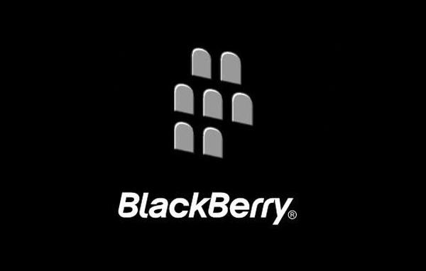
We last heard talk of a supercharged Galaxy S4 LTE Advanced just over a week ago and followed sightings of an S4 powered by the Qualcomm Snapdragon 800 processor in some benchmarks. Now there are reports that the device will be officially unveiled sometime this week and has the model number of SHV-E330s.
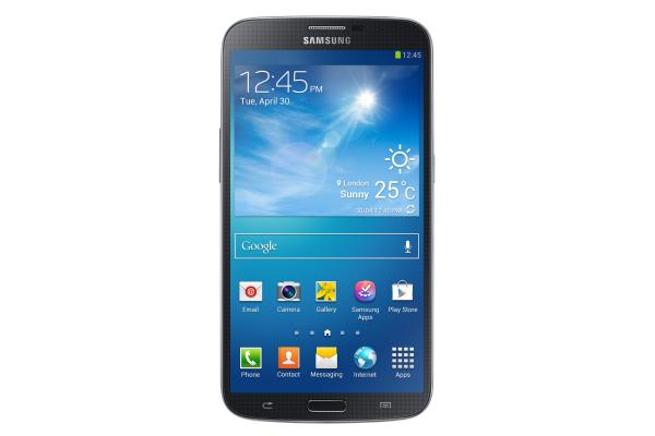
It is expected to launch on the new LTE Advanced SK Telecom network in South Korea while the rest of the specifications of the handset will be the same as the standard version. This will include the same 5-Inch Full HD Super AMOLED display with a resolution of 1920 x 800, and besides the Snapdragon 800 chip will feature 2GB of RAM or there is the possibility this has been increased to 3GB.
Of course the smartphone will still be running the Android 4.2.2 Jelly Bean operating system but it is not currently known if the new version of the Galaxy S4 will see a launch in other markets around the world. There is also talk that the upcoming LG Optimus G2 will also be announced for the new network, and would be ahead of the LG press event taking place in August.
Source: Unwired View.
BlackBerry secure work space on Android and iOS
With the modern mobile technology we now use there is more sensitive information stored onto these devices as they are used for various things such as email or online banking, and now Canadian smartphone manufacturer BlackBerry is looking to help provide a more secure work space on Android and iOS.
The company has today launched a new service that will allow corporate clients and government agencies to better manage and secure mobile devices that are using Android or iOS. This new service will be managed via the BlackBerry Enterprise Service 10 that is a new system that was originally launched at the beginning of this year.
This allows the company’s clients to manage mobile hardware via their internal networks keeping both personal and company information safe on the same device. It provides a safe container to store corporate apps such as emails, contacts, tasks, and the calendar separate from user’s personal apps.
The service has been designed to prevent data leakage that includes copy and paste between the Secure Work Space elements and the rest of the device, and it will also create a fully encrypted tunnel to the server.
This ensures that all communications that come from the device are secure even if the Internet connection that is being used is not, and IT employees will be able to remotely delete these elements without touching the user’s personal data or apps stored onto the device.
Do you think mobile devices are secure enough?
Source: Reuters.
Samsung Galaxy Mega 6.3 playing Smash Cops, Gangstar Vegas
The days of only being able to play the likes of Snake on our mobile phones have long gone thanks to the larger display’s and more powerful processors now found inside modern smartphones, and today we are looking at the Samsung Galaxy Mega 6.3 while playing Smash Cops and Gangstar Vegas.
While the Samsung Galaxy Mega 6.3 may not have the highest resolution display found on a smartphone the screen real estate it offers can prove to be ideal for gaming fans. Recently we looked at some racing games on the device, and today we have another couple of game video reviews for you.
The first one shows the Smash Cops Heat game running on the device and starts with you taking control of a police car, which was found hard to control on a large device with your fingers having to stretch across the display for the controls.
This game has good graphics with the car also having good movement and animation but it seems like the game would be better suited to smaller handsets as you have to smash into things to progress, and can be found on Google Play.
Next up is the Gangstar Vegas game running on the same handset which is a new title from Gameloft that took a while to boot up. You will need plenty of storage on your handset for the game as it is 2.5GB in size with a big story mode.
You are soon thrown into a vehicle shooting almost everything in sight although there are slight pauses in between each scene, but the game has some good graphics and looks a lot of fun to play. To have a go yourself Gangstar Vegas can be found on Google Play here.
Toshiba Excite Write stepping into Samsung Note space
As mobile tech consumers we are treated to a great variety in available products with various price levels and features, and the Toshiba Excite Write is certainly stepping into the Samsung Note mobile space with some of its options.
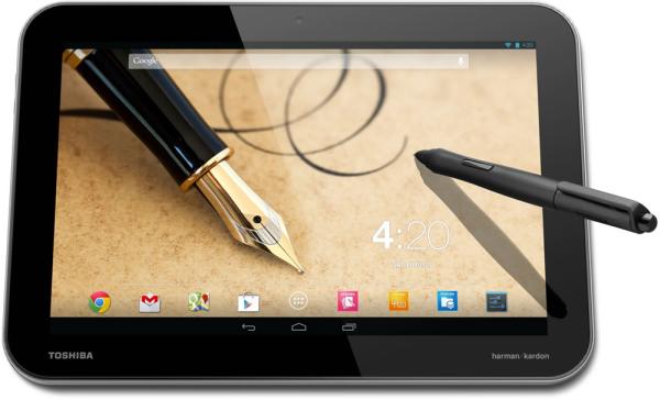
Toshiba recently announced some new tablet PC products running the Android operating system and the Excite Write features a Samsung like stylus pen. The device has a 10.1-inch touchscreen display that uses the Retina Display rival PixelPure, which has a resolution of 2560 x 1600.
Under the hood is a quad core Nvidia Tegra 4 processor with 2GB of RAM and 32GB of on board storage that can be expanded by another 32GB via microSD card. There is an 8-megapixel rear facing camera with the device running Android 4.2 Jelly Bean straight out of the box.
According to the company the Excite Write will offer users a “pen and paper experience” thanks to the touchscreen digitizer, and will make things such as drawing or handwriting notes a lot easier and detailed.
The Toshiba Excite Write is priced at $599 and available from ToshibaDirect.com and currently has a ship estimate of 18th of July with availability expected to spread to other third part resellers, and below we have embedded a number of videos of the device.
Do you like the look of the Toshiba Excite Write?
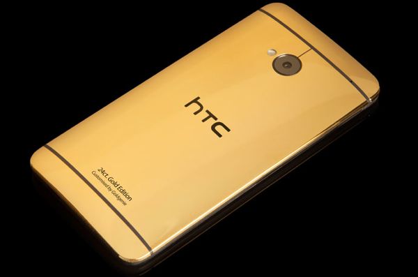
HTC One from £1895 to £2095 for the rich
We all know the HTC One is a great smartphone, but is there a way you can make it better than it already is? Well, how about a price tag stamped on it from £1895 to £2095! These are not for the faint-hearted, more like for the rich.
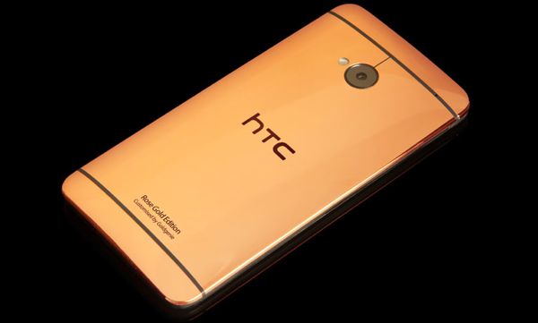
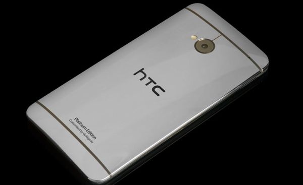
Gold Genie is selling three types of HTC One smartphones, you can either pick the Gold, Titanium or Rose Gold, and these would be best suited for those that do not mind digging into large bank accounts.
The Gold HTC One is priced at £1895, the Rose Gold is £1995 and the most expensive at £2095 is the Titanium version.
We can never fathom why people would spend so much on a smartphone, but if you want to stand out from the crown then maybe these were designed especially for you.
The special high-priced HTC One’s via Gold Genie are SIM-free on any network so will work all around the world; they come with its own luxury cherry oak presentation box as well.
In the box: 24ct Gold Plated HTC ONE, Beats audio Earphones with Remote and Mic, USB Power Adapter, Dock Connector to USB Cable and Documentation – Please do watch the video below.
Would you buy the HTC One smartphone with these marked prices?
Sony Xperia Z Android 4.2.2 update begins global journey
The release of Android firmware updates can often become a frustrating process for owners of certain hardware sometimes being met with delays or problems, but now the Sony Xperia Z Android 4.2.2 Jelly Bean update is beginning its global journey to end users.
A couple of weeks ago there was talk that the new firmware would be arriving soon for the Xperia Z only for reports a few days ago of the new firmware landing on the Sony Xperia ZL first. Now though the software has begun its journey around the world for the company’s flagship smartphone.
The company did promise the handset would receive Android 4.2.2 shortly after it was released but it has now started to hit handsets via an over the air update, and so far owners of unlocked versions of the Xperia Z as well as 4G models are being treated to the new firmware.
It has the version number of 10.3.A.0.423 but as always happens with Android firmware updates it is being released in a staggered fashion, and so far users have received it in The Netherlands, Czech Republic, Spain, and Taiwan for both the C6602 and C6603 versions of the smartphone.
Hopefully it won’t take too long before the new firmware spreads to other regions but certain carriers are sometimes guilty of taking ages to add their extras to the OS before pushing it out to customers. This news comes as Sony is expected to launch a new flagship smartphone later today in the form of the Xperia Z Ultra phablet sized smartphone.
Have you received Android 4.2.2 yet on your Sony Xperia Z?
Source: Xperia Blog.
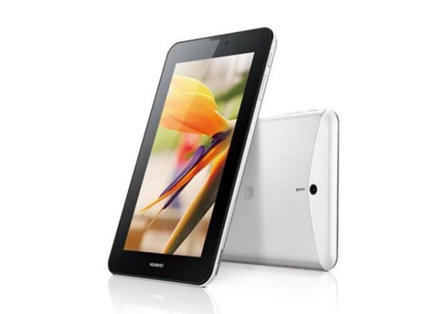
Huawei MediaPad 7 Vogue tablet is somewhat ridiculous
Officially announced today is the new Huawei MediaPad 7 Vogue and it was only last week this was just a leak, some are saying this is going to be better than the Nexus 7 thanks to its specs and ability to make phone calls and send text messages, we do not agree with that for one minute. We are finding a tablet like this a little ridiculous to be honest, we will explain a little below.
The new tablet stroke smartphone will be available first in China this month in black or white, other markets will see a release afterwards.
The aluminum unibody MediaPad 7 Vogue specs include a 7-inch IPS display with 1024 x 600 resolutions, 3MP rear camera and a VGA front-facing camera, it also comes with 1GB RAM, 1.2GHz quad-core processor and is running Android 4.1 Jelly Bean OS.
Other key features include 8GB internal storage, Huawei’s Emotion UI, microSD slot, 16-core GPU, 3G module supports DC-HSPA+, fluid 3D gaming, 42Mbps, 4100mAh Li-Polymer battery, 1080p full HD video playback, and much more.
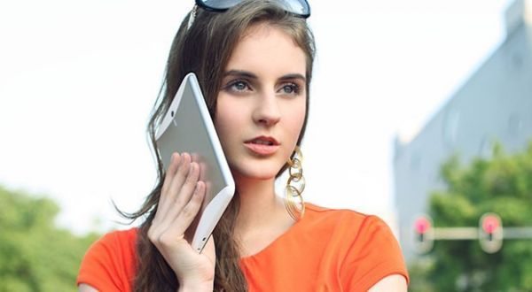
The tablet is only 9.5mm thin and weighs in at 335 grams, and yes you can hold it to your ear and use the tablet a smartphone.
Phones Review Says
In our minds the MediaPad 7 Vogue tablet is ridiculous, we might not be right all the time but to have a 7-inch tab that can be used as a phone is going beyond stupidity. Look at the picture of the lady holding the Vogue up against her ear, it’s just so preposterous to say the least.
It is great to have a 7-inch tablet because this gives you portability, but to have a tablet that allows you to make phone calls is a path Huawei should’ve avoided. The large Samsung Galaxy Mega 6.3 is a large enough smartphone and going beyond 6.3-inches is a tablet and will look stupid holding it like a phone in public, I would not be seen out in the open holding a slab against my ear taking a phone call. The Galaxy Mega 6.3 is a perfect combination of both smartphone and mini tablet, the Vogue tablet has gone beyond being a smartphone and too much to be a tablet.
What are your views on the new Huawei MediaPad 7 Vogue tablet / smartphone?
iOS 7 beta 2 full changelog for iPhone, iPad and mini
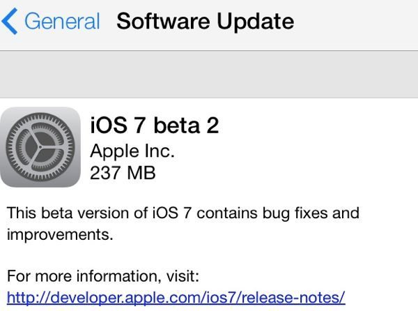
Apple has released its new iOS 7 beta 2 update for the iPhone, iPad and iPad mini today, developers can now get to grips with all the new features added in this new 237 MB download.
This update has been released just 2 weeks after beta 1 was seeded, the full changelog is below, we will mention a few new features here as well.
The Phones Review developer team have been playing around today and we will be revealing more about iOS 7 beta 2 over the next few days. Before we get into the new features, developers can open their settings app running iOS 7 beta 1 and then head into General and then Software update.
When you have done the above it will show the new iOS 7 beta 2 update, which contains bug fixes and improvements, the install takes a few minutes.
iOS 7 beta 2 features is more stable and faster all round, you will also get to see the Voice memos app, new female and male Siri voices, there is a new animation when messages are sent, the message send button is much bigger, and you will also notice within the message app the contacts photos within the conversation threads.
Other little bits include the ability to see message timestamps when you swipe the display to the left, and contact nicknames shows up in messages now rather than the full name. Beta 2 also includes the FaceTime app with a darker background, the reminders app works smoothly with UI touchups, as well as Newsstand app UI changes, and the music controls are now always on lock screen when the songs are playing.
The best part thanks to iOS 7 beta 2 is the ability to use on the iPad and iPad mini, we have also noticed the Clock Icon change inside Control Center, Added button in Weather for additional cities or all-city access, as well as Shared Photo Stream notification.
For more information please visit BGR for the full changelog, we will be bringing you much more once we have played around with iOS 7 beta 2. If you have installed this new update please do let us know what you think in the comments.
Subscribe to:
Posts (Atom)