In this post, we’ll recap some of the resources available for crafting a great tablet experience for your users. These resources are useful for everyone in the app development pipeline—from product managers, to designers, to developers, and QA engineers.
Android Design Guidelines
No conversation about Android app design or development should go very far without first consulting the Android Design guidelines. While most of the sections are relevant to all Android devices, certain sections stand out as particularly relevant to design on tablets.
Following the 48dp rhythm discussed in Metrics and Grids helps take some of the guesswork out of sizing elements, especially for tablets. When in doubt, use multiples of 48dp (or 16dp for a finer grid) for sizing elements horizontally and vertically. For example, when showing sparse content on larger screens, consider using generous side margins of 96dp or 144dp. Or when deciding how wide your master pane should be in a master/detail layout for 10” tablets, see how your master content looks and feels with a width of 240dp or 288dp.

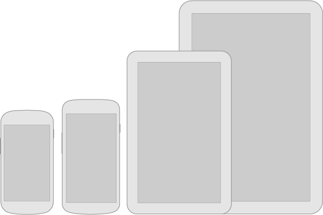
Lastly, the Downloadable Stencils offer designers a great starting point for high-fidelity mockups, complete with reference device outlines, correctly sized action bars, and more.
Android Training for Developers
The Training section of the developer site offers task-oriented technical training material, complete with flow diagrams, code snippets, sample projects and more. Several of these ‘classes’ are geared toward helping developers understand how to scale your apps across any screen size.
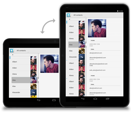
The classes Building a Dynamic UI with Fragments and Designing for Multiple Screens demonstrate how to use fragments in conjunction with Android’s resources framework. They show how to easily choose between tablet and handset layouts at runtime while maximizing code reuse and minimizing your application size using resource aliases. They also demonstrate techniques for adapting UI flows based on the current layout.

Android Design in Action Highlights
Each week, a few of us on the developer relations team get together on the Android Design in Action live show to discuss Android design best practices, as well as provide original ‘redesign’ mockups to help demonstrate our vision of how Android apps should look and feel.A recent episode focused on the topic of responsive design, or designing flexible apps that can adapt to whatever screen size or form factor they’re run on:
In the episode, we celebrated successful examples of responsive design on Android, ranging from creating calendar events in Google Calendar, to browsing wallpapers and stories in Pattrn and Pocket, to playing video in TED, and finally to managing your conference schedule in the open-source Google I/O 2012 app.
We also regularly feature tablet design concepts on the show (some are shown below), so we highly recommend tuning in each week for design ideas.
The Tablet Quality Checklist
Over in the “Distribute” section of developer.android.com, the recently published Tablet App Quality checklist is a great way to check if your app is tablet-ready along a variety of technical dimensions. You should make sure that everyone involved in your mobile products is aware of the standards defined in this checklist, as it is one of the ways in which the Google Play team selects apps to feature in the Staff Picks for Tablets collection.

So What are You Waiting For?
2013 is almost here, and it’s looking to be another exciting year for Android tablets. Make sure your app is positioned to succeed in the evolving device landscape by following some of the best practices and examples discussed here and on the rest of developer.android.com.If you have specific questions about your app, let us know on Google+ (+Android Developers) or Twitter (@AndroidDev)!


No comments:
Post a Comment